Updated 16 December 2025
As discussed in my earlier post on Dark Skies , light pollution is a major nuisance to astronomers both amateur and professional.
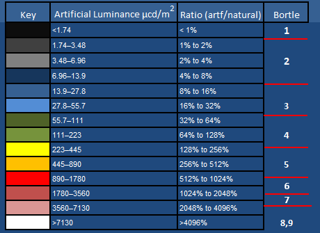
When astronomers classify how much light pollution there is at a particular location, they often use the Bortle Scale, devised by John Bortle and first published in the popular astronomy magazine Sky and Telescope (Bortle 2001). Rather than taking scientific measurements of the brightness of the night sky, Bortle designed his scale for amateur astronomers to the use the visibility of the Milky Way and other astronomical objects to assess how dark the sky is and give it a rating between 1 and 9.

The Bortle Scale
- The first column gives the Bortle classification (between 1 and 9)
- The second column gives the magnitude of the faintest star that an observer with good eyesight can see once their eyes have fully adapted to the dark. The higher the magnitude the fainter the star.
- The Zodiacal light is a very faint yellowish-white glow visible in the night sky and appears to extend from the direction in which the Sun has set or is about to rise. Sunlight scattered by interplanetary dust causes this phenomenon.
On Bortle’s scale, Scale 1 are the darkest skies on Earth. Very few people are fortunate enough to live in such a location. The best most people can hope for in Europe is to be within 3 hours drive of a Bortle Scale 3 location. As urbanisation increases and light pollution gets gradually worse more and more people are living in Bortle Scale 8 and 9 locations. For example, in England the area around Manchester City Centre is Bortle Scale 9.
To further illustrate how the number of astronomical objects visible declines as the amount of light pollution increases I have used the Stellarium planetarium software to illustrate how the area of sky around Orion would look like for Bortle Scale 1, 5 and 9 skies.
Bortle 1 location
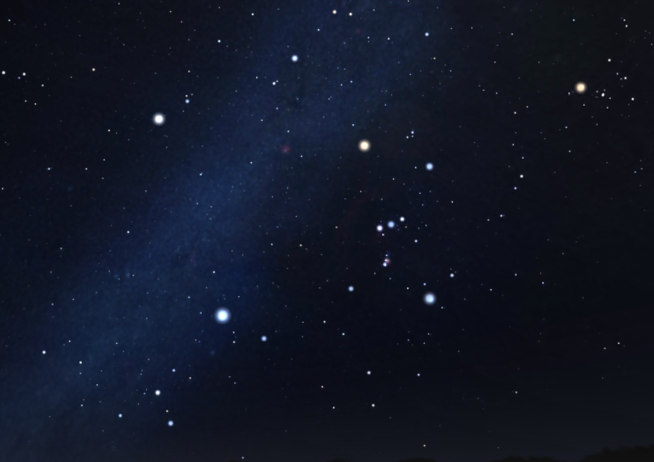
Simulation of how the area around Orion at a Bortle Scale 1 location would appear to a naked-eye observer. This simulation was run for mid-March, three hours after sunset, at a latitude of roughly 53 degrees north. In reality, the brighter stars do not actually appear as discs – just brighter points of light.
Bortle 2 location

Simulation of the area around Orion at a Bortle Scale 5 location. Notice that there are far fewer stars visible and the Milky Way can no longer be seen.
Bortle 9 location

Simulation of the area around Orion at a Bortle Scale 9 location. Notice that there are only a very small number of stars visible and it is difficult to make out Orion
Light Pollution Mapping
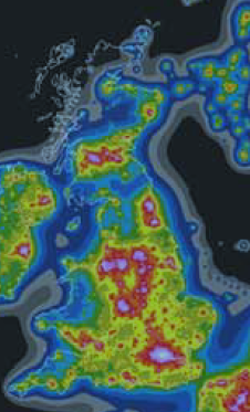
In the UK, as in most industrialised countries, you are never too far away from brightly lit areas. The picture below shows a satellite image of the UK from space.

As you can see in England there is nowhere that is more than 30-40 km from a heavily lit urban area. The position is better in Scotland, once you get away from the Central Belt centred around Glasgow and Edinburgh.
The Falchi Maps
There have been a number of works in recent decades which have produced light pollution maps based upon satellite data. A notable recent work were the maps produced by Falchi et al (2016). They took satellite data over a number of nights for the entire Earth and from this data they created an upwards emission function to predict how much of this light being emitted at ground level would be scattered by the atmosphere, giving the sky a faint human-made glow. They tuned their upwards emission function to 24 000 ground-based measurements made by astronomers at different locations who measured the actual brightness of the night sky. Falchi et al.’s maps were colour-coded as follows.
Key to the Falchi et al maps
Even when there is no Moon above the horizon and no man-made light pollution the night sky is never totally black and glows extremely faintly. The largest contributor to this natural night sky brightness is something called airglow. This is caused by various processes in the upper atmosphere of Earth, such as:
- recombination of atoms which were ionised by the Sun during the day,
- emission of light caused by cosmic rays striking the upper atmosphere,
- chemiluminescence caused mainly by oxygen and nitrogen atoms reacting with free radicals.
The standard unit of luminance (which is how bright a light source appears) is the candela per square metre. As a result of airglow and other factors the night sky directly overhead (when there is no Moon) has a natural luminance of around 174 microcandela per square metre (μcd/m2). If the Sun is more active, there will be more airglow and the night sky will be brighter.
Column headings
- Column 1 colour coding on the map
- Column 2 artificial luminance, in microcandela per square metre
- Column 3 percentage increase over the natural background level.
- Column 4 Bortle Scale (calculated from https://www.handprint.com/ASTRO/bortle.html
The first rows
- All the regions in the maps coloured black have an artificial luminance of less than 1.74 microcandela per square metre. This means that man-made activities have added less than 1% to the natural sky brightness.
- Regions coloured dark grey have an artificial luminance of between 1.74 and 3.48 microcandela per square metre. This means that man-made activities have added between 1% and 2% to natural sky brightness.
- Regions coloured light grey have an artificial luminance of between 3.48 and 6.96 microcandela per square metre. This means that man-made activities have added between 2% and 4% to natural sky brightness.
etc
Example maps from Falchi et al

Light Pollution Map of Europe
As you can see most of Europe is fairly heavily light polluted. Interestingly, the North West of Scotland is one of the areas in Europe least affected, as you can see in more detail below.
This begs the question as to why there aren’t any astronomical observatories in the north west of Scotland. The answer is quite simple, the north west of Scotland is one of the wettest areas in the UK and the skies have on average a high degree of cloud cover. This limits the time that observers can actually see the night skies!

Light Pollution map of the US
It is interesting just how light polluted the eastern half is the US compared to its western half. There are still sizeable areas of the western US where there is virtually no light pollution.

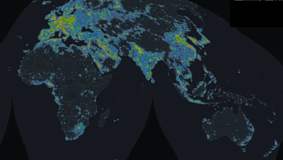
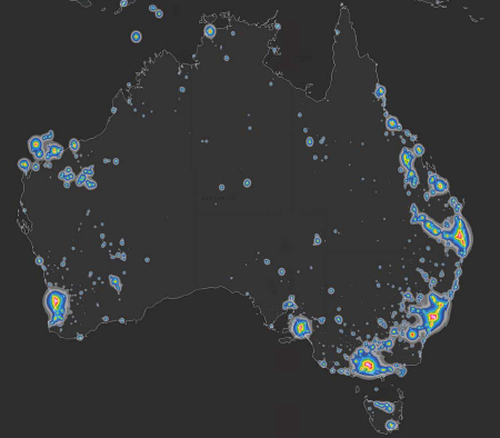
Light Pollution map of the entire world
If you look at the picture of the whole world we see that there are still substantial land areas where there is very little light pollution. With the exception of Africa, these are all areas where there is a low population density such as northern Canada, parts of South America, the Himalayas and the interior of Australia. Australia is a particularly interesting case. 88% of the country’s land area has virtually no light pollution, which is one of the highest figures for any country in the world. However, only 2% of the country’s population actually live in an area where there is no light pollution. This is because the vast majority of Australians live in urban areas. In fact, the percentage of Australian’s living under heavily light polluted skies is actually higher than in the much more densely populated European Union.
Related Posts
I hope you have enjoyed this post. Here are a selection of other related posts from Explaining Science
- Dark Skies and light pollution
- The work of the International Dark-Sky Association
- The magnitude scale used by astronomers to measure the brightness of celestial objects.
There is also a video on the Explaing Science YouTube channel about the magnitude scale
References
Bortle, J. E. (2001) ‘Introducing the Bortle Dark Sky Scale’, Sky & Telescope, 101(2), pp. 126.
Falchi, F, Cinzano, P, Duriscoe, D, Kyba C M C, Elvidge C D, Baugh, K, Portnov, B A, Rybnikova, N A, Furgoni, R (2016) ‘The new world atlas of artificial night sky brightness’, Science Advances, 2(6), pp. [Online]. Available at: https://advances.sciencemag.org/content/advances/2/6/e1600377.full.pdf (Accessed: 15 December 2025).

Grreat blog you have here
LikeLike
Thank you David. You might be interested in looking at some of the videos on https://www.youtube.com/explainingscience too
LikeLike
[…] Hernandez: I live on a Bortle 6/7 sky, moderate light pollution but if subject elevation is high it probably compares to around […]
LikeLike
[…] Hernandez: I live on a Bortle 6/7 sky, moderate light pollution but if subject elevation is high it probably compares to around […]
LikeLike
[…] Hernandez: I live on a Bortle 6/7 sky, moderate light pollution but if subject elevation is high it probably compares to around […]
LikeLike
[…] Hernandez: I live on a Bortle 6/7 sky, moderate light pollution but if subject elevation is high it probably compares to around […]
LikeLike
I never knew how much illuminated world we live in until I started looking up in the sky. Especially being in an urban dwelling, there isn’t much left to see in the sky apart from the popular stars n planets.
However I keep trying.
Somedays I see magnitude +3 stars.
I wish to be able to see something of +4 magnitude.
I can only dream how it will look when it will be possible to +6.
It will feel as if floating in the sky on a ship called as Earth. 🙂
LikeLike
[…] Source link […]
LikeLike
[…] Source link […]
LikeLike
Very interesting article. The heat maps show a level of granularity in the measurement that’s hard to detect just by looking at light intensity (say, from a night-time satellite photo). I’d be interested in seeing development and changes over time. Did you find any good references for that?
LikeLike
I would suggest looking at this article
https://www.nps.gov/subjects/nightskies/growth.htm
LikeLiked by 1 person
[…] the whole of the UK. The park is has some of the darkest skies in England and is rated as 3 on the Bortle Scale. Land developers who wish to be active in the area are only given permission to do so if they […]
LikeLike